Design Coaching & Craft Evaluation

Developing senior designers through systematic visual design analysis and strategic decision-making

The Dual Challenge

Product Challenge: Our procedure editing interface was outdated—bloated UI, unclear hierarchy between activity and task content, and interaction patterns that felt dated compared to modern tools.

Development Opportunity: I had a talented mid-level designer ready for senior-level work. Rather than designing the solution myself, I used this modernization project as a coaching opportunity to develop her craft evaluation skills and strategic thinking.

Active Project - Designer Promoted, Implementation Ongoing

Current State: The Legacy Experience

What We Were Modernizing
Legacy procedure editing interface showing outdated visual design, bloated UI, and unclear hierarchy

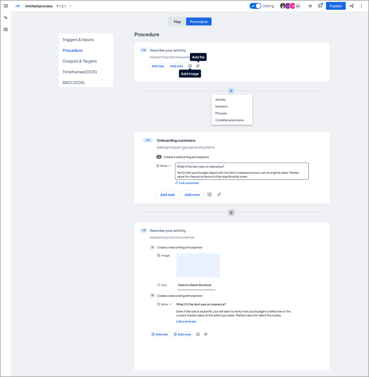
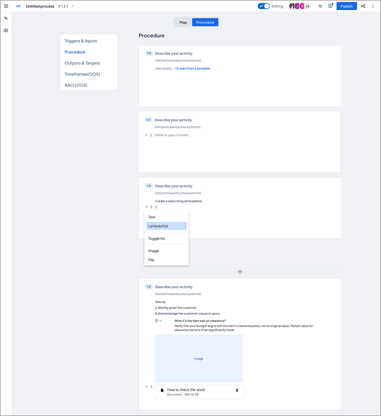
Original interface: Outdated visual design, bloated UI with excessive options, and unclear hierarchy between activity-level and task-level content

Problems to Solve:

My Coaching Approach

Instead of directing the designer toward a specific solution, I taught her to evaluate design options systematically using three lenses:

Visual Design Assessment

  • How does visual hierarchy guide user attention?
  • Does spacing create natural scanning patterns?
  • Are interactive elements clearly afforded?

Interaction Pattern Analysis

  • How discoverable are key actions?
  • Does the pattern match user mental models?
  • What's the cognitive load at each step?

User Impact Consideration

  • Who does this serve well?
  • Who might struggle with this approach?
  • How does it balance different user needs?

The Design Options

The designer explored two fundamentally different approaches. I coached her to create a systematic comparison that would help stakeholders understand the tradeoffs.

Design Evaluation Framework

Option 1: Prescriptive, Structured Approach

Prescriptive approach showing explicit UI controls, structured layout with clear boundaries

Prescriptive approach: Explicit controls and guidance with visible structure and clear boundaries

Visual Design Analysis

Strengths

  • Clear visual hierarchy separates activity-level content from nested task/note details
  • Explicit button labels ("Add task", "Add note", image/file icons) provide clear affordances
  • Familiar "Add [content type]" pattern reduces learning curve for new users
  • Structured layout with consistent spacing creates predictable scanning pattern

Concerns

  • Multiple button options at bottom of each activity could create visual clutter and decision fatigue
  • "Add participant(s) and system(s)" secondary section competes with activity name for visual priority
  • Still rather rigid structure - is modernization enough to differentiate from legacy experience?
  • Visual weight distributed across many UI elements rather than focusing on primary actions
Interaction Pattern Analysis

Strengths

  • Explicit controls make all actions discoverable without exploration
  • Users can add different content types (tasks, notes, images, docs) in any order
  • Button group always visible at activity level - no hidden interactions

Concerns

  • Requiring users to choose content type upfront (task vs. note vs. image) adds cognitive load before they can start working
  • Every activity shows all options regardless of whether user needs them
  • Pattern assumes users know what content type they need before creating it
User Impact: This approach serves conservative users transitioning from legacy systems (familiar patterns reduce change resistance) and new users who need scaffolding to understand available features. However, power users who want to work quickly without clicking through options may find the structure adds friction, and teams with simple documentation needs may feel the structure is over-engineered.

Option 2: Flexible, Free-Form Approach

Flexible approach showing minimal interface, less exposed structure, more like modern authoring tools

Flexible approach: Less exposed structure with more flexible editing experience, interaction pattern similar to Notion

Visual Design Analysis

Strengths

  • Very clean, minimal interface lets procedure content be the visual focus
  • Reduced chrome and UI controls create more breathing room for actual content
  • Typography and spacing prioritize readability over feature exposure
  • Modern aesthetic aligns with contemporary collaboration tools users already know

Concerns

  • Slash command (/) interaction completely hidden - no visual cue this functionality exists
  • Editing actions tucked behind icons without labels - users must discover through trial
  • Minimalist approach removes visual scaffolding that helps users understand document structure
  • Generic content blocks don't distinguish between tasks, notes, and narrative text at a glance
Interaction Pattern Analysis

Strengths

  • "/" slash command allows fast content insertion for users who learn it - type naturally, invoke menu when needed
  • Inline editing reduces mode-switching - users stay in content flow rather than clicking buttons
  • Flexible text entry removes friction - start typing immediately without choosing content type
  • Modern pattern familiar from Notion, Slack, ClickUp - low learning curve for users of these tools

Concerns

  • Discoverability crisis - users won't know "/" triggers options without onboarding or documentation
  • Hidden functionality creates "expert" vs. "novice" divide - power users thrive, new users struggle
  • No visual distinction between task ("a. Warmly greet customer") vs. descriptive text - semantic meaning lost
  • Abstraction through generic terms ("text", "lettered list", "toggle list") may obscure that this is process documentation with specific structure and the terms are non-standard
User Impact: This approach serves new customers familiar with modern editing tools (immediate comfort with interaction patterns), users who want to document quickly without UI friction, and teams creating simple, narrative-style procedures without complex task hierarchies. However, users expecting explicit process structure (activities → tasks → notes) may struggle with the flexible format not enforcing this, teams needing consistency across documentation may see too much flexibility leading to varied patterns, and anyone without prior exposure to slash-command interfaces will face a completely hidden functionality crisis.

Strategic Decision & Evolution

The team chose Option 1 (prescriptive approach) because our existing user base expected explicit process structure and we needed to minimize change resistance during the modernization.

We continued iterating on the procedure view design, working toward a final version that would build on the strengths we identified. As we refined the details, I coached the designer to collaborate with our design system team to align similar interaction patterns across platform capabilities—work the design system team ultimately picked up to ensure consistency.

Final Procedure View Design
Final procedure view design incorporating iteration learnings and design system alignment

Final procedure view: Refined through iteration, incorporating evaluation learnings and aligned with platform design system patterns

Coaching Moment: Rather than viewing this as "handing off" work to another team, I coached the designer to see the design system team's involvement as validation that our patterns were valuable enough to scale across the platform. This is exactly the kind of strategic collaboration senior designers need to recognize and leverage.

Simultaneously, we shifted focus to designing a complementary map view visualization. After consulting with engineering, we learned the map view presented bigger technical unknowns that needed deeper exploration. As a complement to the procedure view, the map view would serve our existing user base who needed to visualize process flows—making it the ideal candidate for the deep user testing and technical validation we needed to conduct next.

The designer is currently iterating on the map view approach through user testing with our target user group, applying the same systematic evaluation framework we established during the initial comparison.

Impact & Outcomes

Product Impact

  • Modernized interface approach approved by stakeholders
  • Systematic evaluation framework now used across team for design decisions
  • Design system team adopted interaction patterns for platform-wide consistency
  • User testing validating map view iteration (ongoing)
  • Strategic collaboration demonstrated cross-team design maturity

Designer Development Impact

  • Promoted from mid-level to senior designer
  • Developed systematic approach to visual design evaluation
  • Built confidence presenting design rationale to stakeholders
  • Learned to recognize when design system collaboration adds strategic value
  • Navigated technical constraints by consulting engineering early
  • Now coaches other designers using similar frameworks

Leadership Reflection

On coaching through craft: The best way to develop senior-level designers is to teach them how to think systematically about design decisions, not just execute solutions. By creating evaluation frameworks together, I helped this designer build lasting analytical skills she now applies to every project.

On developing judgment, not just taste: Visual design isn't just about what looks good—it's about understanding why certain approaches serve certain users better than others. The side-by-side comparison forced explicit discussion of tradeoffs, which is exactly the kind of thinking senior designers need to demonstrate.

On strategic collaboration: When the design system team picked up our interaction patterns, I coached the designer to view this as success, not loss of ownership. Learning to recognize when your work scales beyond your immediate project is a critical senior-level insight.

Most importantly: This designer's promotion wasn't because she executed my vision—it was because she developed her own systematic approach to design evaluation that she'll carry throughout her career. That's the real measure of successful coaching.